NNI Construction: Strategic Logo Rebranding for Construction Company
NNI Construction: Strategic Logo Rebranding for Construction Company
Complete Logo & Brand Identity Refresh | 2025
Complete Logo & Brand Identity Refresh | 2025
The Brief
This project involved creating a complete rebranding package for NNI Construction, a growing construction company looking to establish a more professional market presence. The client needed a comprehensive visual identity that would reflect their quality craftsmanship while appealing to both residential and commercial clients. They required a versatile brand system that could be applied across multiple touchpoints.
This project involved creating a complete rebranding package for NNI Construction, a growing construction company looking to establish a more professional market presence. The client needed a comprehensive visual identity that would reflect their quality craftsmanship while appealing to both residential and commercial clients. They required a versatile brand system that could be applied across multiple touchpoints.
The Challenge
NNI Construction needed to stand out in a competitive market where many construction companies use similar visual approaches. The challenge was to create a distinctive brand identity that communicated precision and reliability while avoiding construction industry clichés. Additionally, we needed to develop a system that would work effectively across digital platforms, physical materials, and on-site applications like vehicle graphics and signage.
NNI Construction needed to stand out in a competitive market where many construction companies use similar visual approaches. The challenge was to create a distinctive brand identity that communicated precision and reliability while avoiding construction industry clichés. Additionally, we needed to develop a system that would work effectively across digital platforms, physical materials, and on-site applications like vehicle graphics and signage.

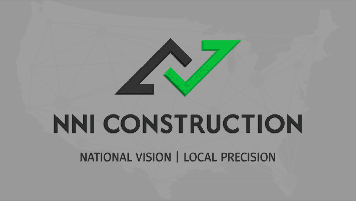
The Logo
The NNI Construction logo is a bold and geometric symbol showcasing a harmony of complexity and simplicity. It was important that I included a check mark in the logo to symbolize their efficiency. When the checkmark is modified and rotated, it resembles roof geometry. And when spaced perfectly, these elements reveal an "N" in the negative space between them. The result is a clean mark that communicates both construction expertise and quality verification.
The NNI Construction logo is a bold and geometric symbol showcasing a harmony of complexity and simplicity. It was important that I included a check mark in the logo to symbolize their efficiency. When the checkmark is modified and rotated, it resembles roof geometry. And when spaced perfectly, these elements reveal an "N" in the negative space between them. The result is a clean mark that communicates both construction expertise and quality verification.

The Typography
The typography breaks from construction industry norms while maintaining professionalism. Afacad Flux serves as the primary typeface, chosen for its geometric precision and contemporary feel for headlines. Fira Sans provides high legibility for body text. Together, they create a clear hierarchy across all brand applications.
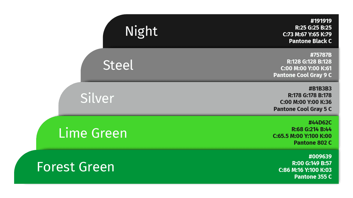
The Color Palette
The color system features strategic green tones and complementary neutrals. A vibrant lime green gradient brings energy and distinguishes NNI from competitors, while deep forest green adds stability. Carefully selected neutral tones provide versatility across applications while maintaining a premium quality throughout all materials.
The color system features strategic green tones and complementary neutrals. A vibrant lime green gradient brings energy and distinguishes NNI from competitors, while deep forest green adds stability. Carefully selected neutral tones provide versatility across applications while maintaining a premium quality throughout all materials.
The Transformation
The original logo was a gray and blue rounded square with lowercase “nni construction” which offered a sense of stability but a lack of distinction. While the colors weren’t off-brand, they didn’t capture the youthful energy or forward momentum NNI aimed to express. With a redesigned logomark and a more cohesive brand system, NNI repositioned itself as a precise, modern construction partner built for efficiency and growth.
The original logo was a gray and blue rounded square with lowercase “nni construction” which offered a sense of stability but a lack of distinction. While the colors weren’t off-brand, they didn’t capture the youthful energy or forward momentum NNI aimed to express. With a redesigned logomark and a more cohesive brand system, NNI repositioned itself as a precise, modern construction partner built for efficiency and growth.
Brand in Action
A collection of branded assets and mockups.

Stationery & Print Collateral
Stationery & Print Collateral

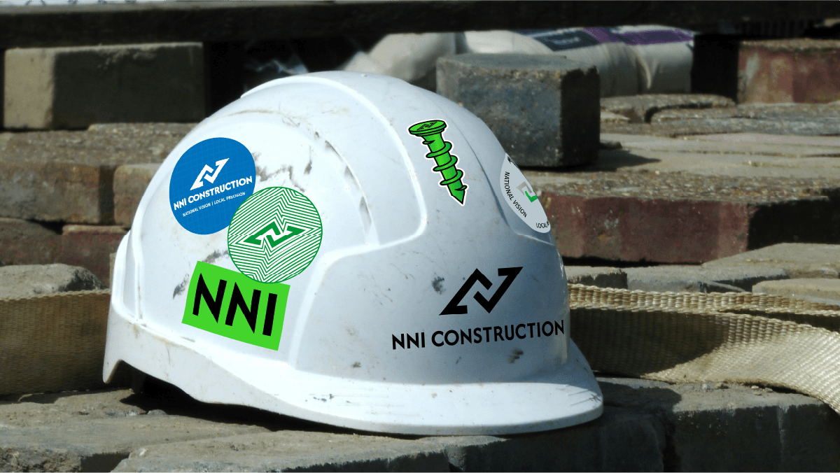
Workwear Branding
Workwear Branding
On-Site Safety Signage
On-Site Safety Signage
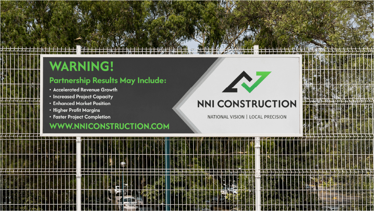
Marketing Banner
Marketing Banner
Project Outcome
Project Outcome
The revitalized brand system demonstrably elevates NNI Construction's presence. Through consistent and strategic application across all business materials—from corporate communications featuring calculated green accents to robust on-site applications like hard hat stickers—the identity achieves immediate recognition and reinforces professionalism. This adaptable visual framework effectively communicates their unique position of national capabilities with local precision, providing NNI with a strong foundation to stand out from competitors and drive future growth.
The revitalized brand system demonstrably elevates NNI Construction's presence. Through consistent and strategic application across all business materials—from corporate communications featuring calculated green accents to robust on-site applications like hard hat stickers—the identity achieves immediate recognition and reinforces professionalism. This adaptable visual framework effectively communicates their unique position of national capabilities with local precision, providing NNI with a strong foundation to stand out from competitors and drive future growth.
Testimonial
Testimonial
"Phenomenal communicator, listener, and designer"
- Brian Miller | NNI Construction
"Phenomenal communicator, listener, and designer"
- Brian Miller | NNI Construction
"Phenomenal communicator, listener, and designer"
- Brian Miller | NNI Construction