INVERSIV: Logo Redesign and Brand Foundation for Design & Fabrication Business
INVERSIV: Logo Redesign and Brand Foundation for Design & Fabrication Business
Logo Redesign Project | 2024
Logo Redesign Project | 2024
The Brief
Paul owns INVERSIV, a precision laser fabrication and 3D printing company. His existing logo featured two Penrose triangles blended together that couldn't be cleanly produced through his own manufacturing processes due to multiple gray tones and complex shading. This created an obvious disconnect: a fabrication company whose logo couldn't be fabricated by their own equipment. Paul needed a redesign that maintained brand recognition while creating something he could actually laser cut or 3D print for promotional products.
Paul owns INVERSIV, a precision laser fabrication and 3D printing company. His existing logo featured two Penrose triangles blended together that couldn't be cleanly produced through his own manufacturing processes due to multiple gray tones and complex shading. This created an obvious disconnect: a fabrication company whose logo couldn't be fabricated by their own equipment. Paul needed a redesign that maintained brand recognition while creating something he could actually laser cut or 3D print for promotional products.
The Challenge
The original INVERSIV logo undermined Paul's professional credibility as a precision manufacturer. When clients saw promotional items with poorly reproduced logos, it contradicted his promises of tight tolerances and clean production. We needed to create a mark that could be perfectly manufactured using INVERSIV's own equipment while preserving the optical illusion concept that had become recognizable to his clients.
The original INVERSIV logo undermined Paul's professional credibility as a precision manufacturer. When clients saw promotional items with poorly reproduced logos, it contradicted his promises of tight tolerances and clean production. We needed to create a mark that could be perfectly manufactured using INVERSIV's own equipment while preserving the optical illusion concept that had become recognizable to his clients.

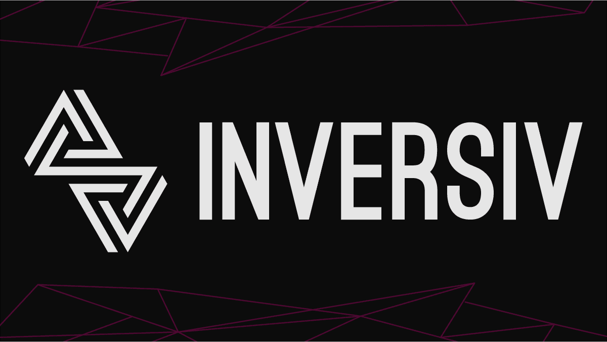
The Logo
I reconstructed the dual Penrose triangle concept using an isometric grid that eliminated the need for multiple gray tones and shading. The redesigned mark maintains the optical illusion through clean, consistent line weights and precise angles that mirror the exacting standards of Paul's fabrication work. By reducing the design to pure geometry with single-color reproduction, the logo can now be perfectly laser cut from various materials—functioning as both brand identity and demonstration of INVERSIV's technical capabilities in a single mark.
I reconstructed the dual Penrose triangle concept using an isometric grid that eliminated the need for multiple gray tones and shading. The redesigned mark maintains the optical illusion through clean, consistent line weights and precise angles that mirror the exacting standards of Paul's fabrication work. By reducing the design to pure geometry with single-color reproduction, the logo can now be perfectly laser cut from various materials—functioning as both brand identity and demonstration of INVERSIV's technical capabilities in a single mark.

The Color
The new color system uses just three colors: Off-White (#E6E6E6), Magenta (#D300D3), and Black (#0C0C0C). The off-white and off-black directly reference the company name "INVERSIV," creating subtle inverse values rather than stark contrasts—a more sophisticated approach that reproduces better in both digital and physical applications. The magenta accent comes directly from the distinctive glow of Paul's custom-built CO2 laser, connecting the brand identity to the actual equipment used in his workshop. This combination creates immediate visual impact while ensuring perfect reproduction across all manufacturing methods.
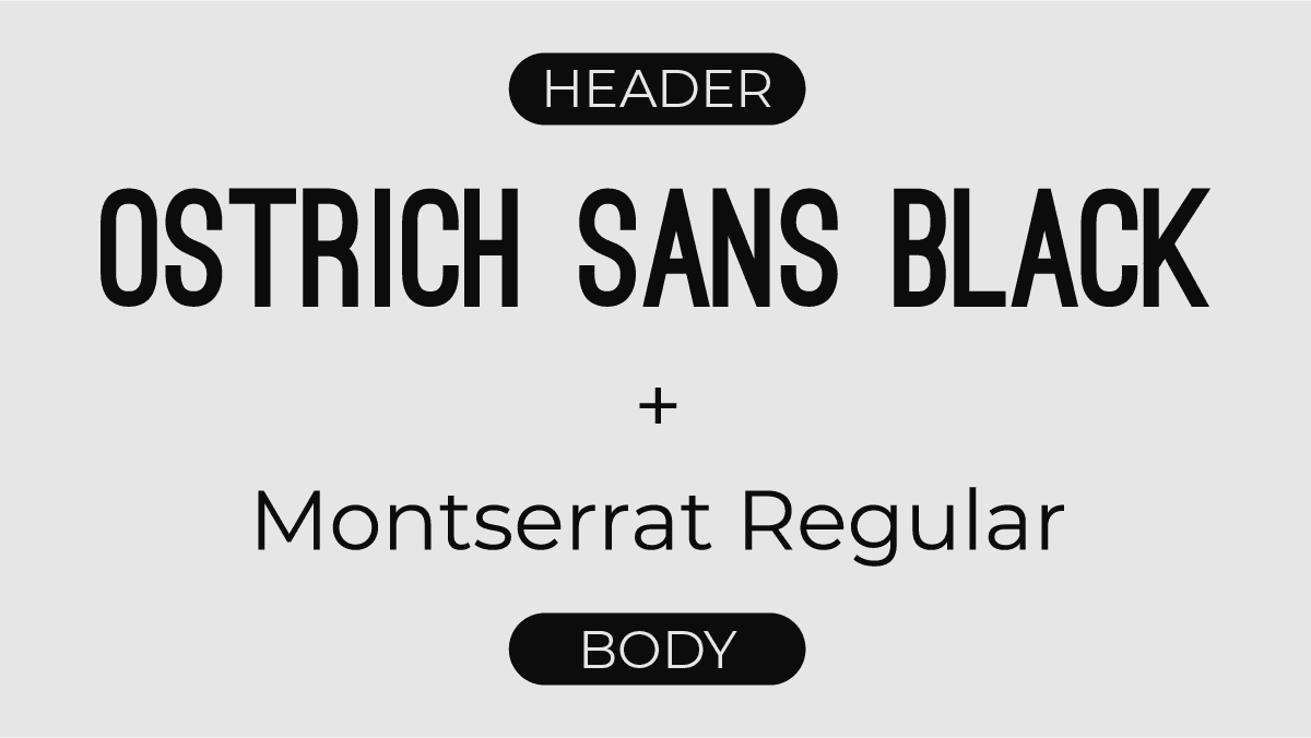
The Typography
Ostrich Sans Black and Montserrat Regular create a typographic system that mirrors the precision of INVERSIV's work. Ostrich Sans features geometric forms with consistent stroke weights—directly complementing the redesigned logo. The typography was specifically selected to work across digital platforms, printed materials, and—most importantly—fabricated signage where clean, defined edges are essential for successful production.
Ostrich Sans Black and Montserrat Regular create a typographic system that mirrors the precision of INVERSIV's work. Ostrich Sans features geometric forms with consistent stroke weights—directly complementing the redesigned logo. The typography was specifically selected to work across digital platforms, printed materials, and—most importantly—fabricated signage where clean, defined edges are essential for successful production.

Brand in Action
A collection of branded assets and mockups.

3D printed variation of new logo
Project Outcome
Project Outcome
The redesigned identity now serves as INVERSIV's most effective demonstration of craftsmanship. Paul uses his laser equipment to cut the logo into various materials, creating unique business cards and promotional items that showcase his precision capabilities. Prospects can physically handle these items, experiencing the clean edges and tight tolerances that define INVERSIV's work. The logo has become more than identification—it's a tangible portfolio piece that starts conversations and closes sales. Most importantly, the redesign maintains the core concept clients recognized while resolving the previous disconnect between brand promise and delivered quality.
The redesigned identity now serves as INVERSIV's most effective demonstration of craftsmanship. Paul uses his laser equipment to cut the logo into various materials, creating unique business cards and promotional items that showcase his precision capabilities. Prospects can physically handle these items, experiencing the clean edges and tight tolerances that define INVERSIV's work. The logo has become more than identification—it's a tangible portfolio piece that starts conversations and closes sales. Most importantly, the redesign maintains the core concept clients recognized while resolving the previous disconnect between brand promise and delivered quality.
Testimonial
Testimonial
"Working with Tommy was exactly what INVERSIV needed. He took the time to understand my business and created a brand identity that genuinely represents who we are. Since launching the new designs, we've noticed an increase in orders made from new customers. Our marketing materials finally match the quality of our work, and that's made the biggest difference."
- Paul Stifler | Owner, INVERSIV