
Brood Coffee Company: Conceptual Brand Identity Design
Passion Project | 2024 - Available for purchase
Passion Project | 2024 - Available for purchase
The Brief
Brood Coffee is a passion project I created to explore more playful branding styles while building a complete identity system. The concept plays on the dual meaning of "brood" – a nod to both "brewed" coffee and the grumpy mood many people experience before their morning cup. This self-directed project gave me freedom to experiment with hand-drawn elements and develop a brand with personality that would stand out in the saturated coffee market.
Brood Coffee is a passion project I created to explore more playful branding styles while building a complete identity system. The concept plays on the dual meaning of "brood" – a nod to both "brewed" coffee and the grumpy mood many people experience before their morning cup. This self-directed project gave me freedom to experiment with hand-drawn elements and develop a brand with personality that would stand out in the saturated coffee market.
The Challenge
Most coffee brands either lean into pretentious artisanal aesthetics or corporate sameness. Brood Coffee acknowledges the reality that coffee isn't just about sophisticated flavors – it's about transforming from grumpy to functional. This concept resonates with everyday coffee drinkers who don't take themselves too seriously but still appreciate quality. The brand creates an honest, approachable personality by embracing the morning grumpiness coffee helps solve rather than just celebrating the drink itself.
Most coffee brands either lean into pretentious artisanal aesthetics or corporate sameness. Brood Coffee acknowledges the reality that coffee isn't just about sophisticated flavors – it's about transforming from grumpy to functional. This concept resonates with everyday coffee drinkers who don't take themselves too seriously but still appreciate quality. The brand creates an honest, approachable personality by embracing the morning grumpiness coffee helps solve rather than just celebrating the drink itself.

The Logo
The Brood Coffee logo was created using my actual handwriting with a wide-tip Sharpie to form the letters B, R, and D. I intentionally left space for the "OO" to become coffee cups with grumpy eyes – creating a visual pun that captures the brand concept. This hand-drawn approach gives the logo an authentic, slightly imperfect quality that stands apart from polished corporate coffee brands. The logo works equally well across packaging, merchandise, and signage while maintaining its distinctive personality at any scale.
The Brood Coffee logo was created using my actual handwriting with a wide-tip Sharpie to form the letters B, R, and D. I intentionally left space for the "OO" to become coffee cups with grumpy eyes – creating a visual pun that captures the brand concept. This hand-drawn approach gives the logo an authentic, slightly imperfect quality that stands apart from polished corporate coffee brands. The logo works equally well across packaging, merchandise, and signage while maintaining its distinctive personality at any scale.

The Typography
The typography breaks from construction industry norms while maintaining professionalism. Afacad Flux serves as the primary typeface, chosen for its geometric precision and contemporary feel for headlines. Fira Sans provides high legibility for body text. Together, they create a clear hierarchy across all brand applications.
The Process
I started by experimenting with different handwritten styles, focusing on creating letters with enough character to feel distinctive but with sufficient clarity to ensure readability. The breakthrough came when I realized the two O's could become coffee cups with grumpy eyes, perfectly embodying the brand concept in a visual pun. I refined the letterforms through multiple iterations, maintaining the authentic hand-drawn quality while ensuring it would reproduce clearly across applications. The final design balances professional functionality with playful personality – exactly what I wanted this passion project to achieve.
The Colors & Type
The color palette pairs a rich dark brown with a light bluish-gray as foundation colors, creating stability and coffee-appropriate tones. To differentiate from typical coffee brands, I added warm accent colors – red, orange, and yellow – that inject energy and vibrancy like a caffeine boost. This combination stands out from the usual brown and tan coffee shop color schemes while still feeling appropriate for the category. For typography, I paired the hand-drawn logo with Jackwrite – a font reminiscent of coffee-stained typewriter text. This selection complements the handcrafted main logo while adding texture and character to packaging and menus. The slightly distressed quality of Jackwrite reinforces the brand's honest, unpretentious personality while maintaining excellent readability across all applications.
The color palette pairs a rich dark brown with a light bluish-gray as foundation colors, creating stability and coffee-appropriate tones. To differentiate from typical coffee brands, I added warm accent colors – red, orange, and yellow – that inject energy and vibrancy like a caffeine boost. This combination stands out from the usual brown and tan coffee shop color schemes while still feeling appropriate for the category. For typography, I paired the hand-drawn logo with Jackwrite – a font reminiscent of coffee-stained typewriter text. This selection complements the handcrafted main logo while adding texture and character to packaging and menus. The slightly distressed quality of Jackwrite reinforces the brand's honest, unpretentious personality while maintaining excellent readability across all applications.
Brand in Action
A collection of branded assets and mockups.

Business Cards
Business Cards
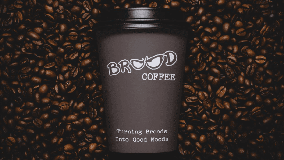
Branded To-Go Cup
Branded To-Go Cup

Menu & Apparel Design
Menu & Apparel Design

Coffee Packaging Design
Coffee Packaging Design